UW | Sweetener

Sweetener
UW, hcde 518 user-centered design, fall 2021
UX Design / UX Research / Digital Prototypingshowcase board | prototype
Brief
The first class of UW’s HCDE MS Program is a crash course in user-centered design, where students form 4-person teams, coalesce on a design question to explore with their team, then set out to rapidly research the problem space and generate a design solution to address it within the 10-week quarter. My team had one glaring commonality - we were worried about balancing our growing plate of responsibilities that now included grad school, as we’d each gotten swept up in the hamster wheel of undergrad and spit out with little sense of purpose remaining when we finally passed the graduation finish line. We were curious about how to help students become more aware of and aligned with their own priorities and foster their wellbeing.
However, through user research, we learned that students didn’t have the capacity to consider purpose or values due to the overwhelming stress they were already experiencing, so we pivoted to helping them manage their stress. We found that their preferred way to relax and reflect was by connecting with friends and family, but that they struggled to find time to do so due to work, school, and other obligations. That created a critical mismatch - community support was the most impactful factor in making students feel less overwhelmed, yet they didn’t have the capacity to pursue getting that support when they felt overwhelmed. Our solution sought to provide the relief of supportive, meaningful social interactions with minimal effort and without needing to interact in real-time.
Outcome
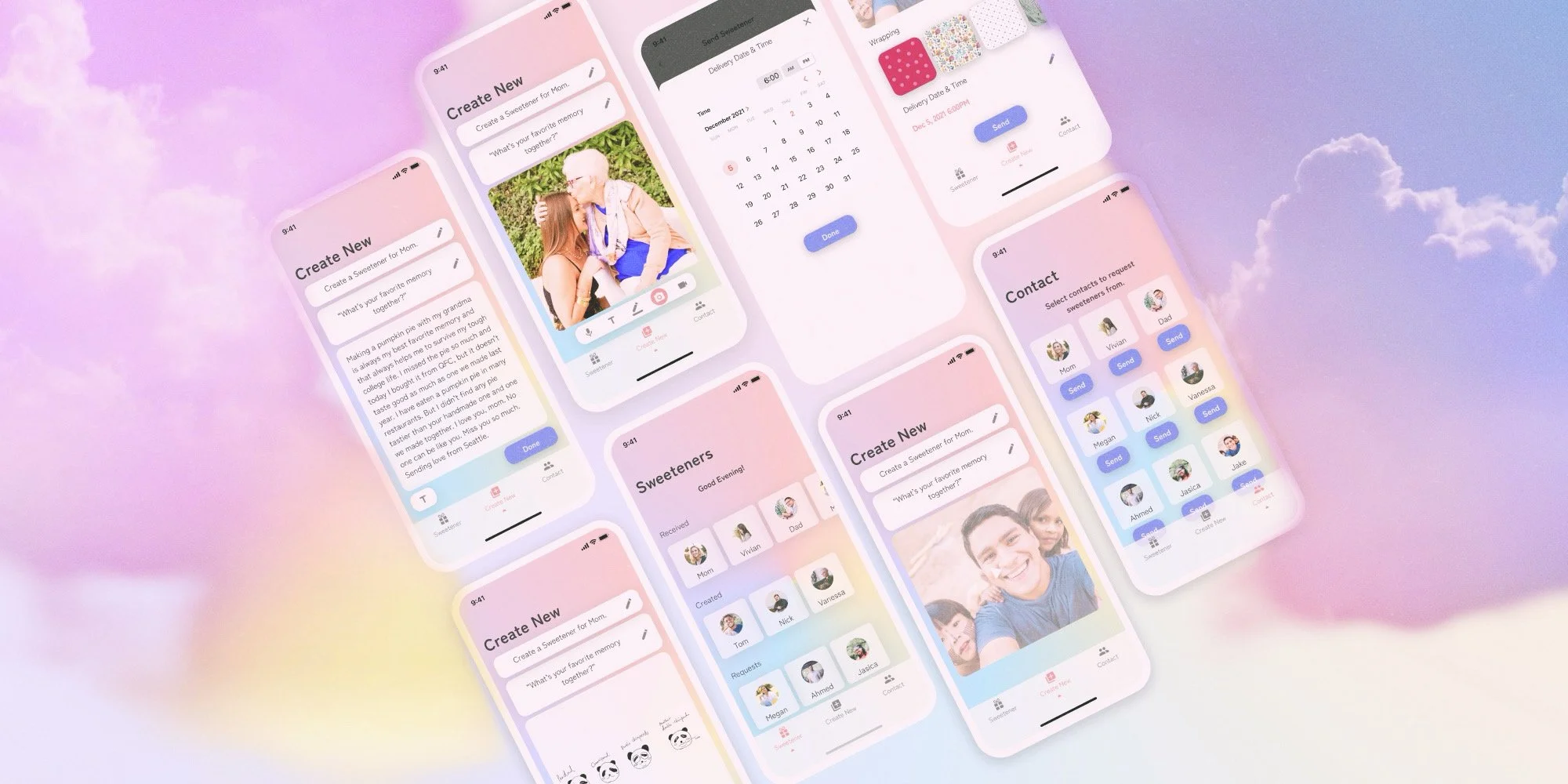
Designed Sweetener, a mobile app facilitating low-touch, creative ways to brighten someone’s day. Choose a contact, record your response to a thoughtful prompt, wrap it up in a cute package, and schedule its delivery. Or ask for a little sugar! Reach out to family and friends and request one to lift you up when you’re down. Sweeteners let you show up for the people you love, and give them the opportunity to do the same for you.
Quotes
“This might be the most wholesome project I have seen in all the times I have taught this class! Such a lovely concept and really nice evolution to see you go from your initial idea to your fully fleshed out project.” - Julie Kientz, 518 Professor & Chair of UW HCDE Department
Other feedback from the showcase…
“This is by far the most eye catching board on this panel. You guys did an amazing job! I love this idea and your design is fantastic!”
“Love your idea, I want to use this! I’m so impressed with how your research informed your design.”
“Love the coherence of the design concept and metaphor.”
Process
Initial Design Question
How can we help college students explore and prioritize what contributes to their sense of purpose and well-being?
Research
Semi-Structured User Interviews: Conducted with 6 students to gain deeper insight into students' experiences with stress, sense of purpose, and well-being. Lasted 60 minutes each, covering personal experiences, coping mechanisms, and the role of technology in managing well-being.
Identified the overwhelming struggle to balance life's responsibilities and the desire for more meaningful social connections and activities.
Survey: Aimed at identifying broader trends and behaviors among college students regarding stress management and well-being. 38 students participated.
Identified a disconnect between the importance of social connections, creativity, and well-being and the amount of time devoted to these vs. school and work, with students expressing a desire to invest more time in the former and a consistent trend of leaning on social networks to combat stress.
Competitive Analysis: Evaluated 12 existing products addressing stress, purpose, and well-being to identify gaps that the new solution could fill with a focus on journaling, reflection, productivity, and games.
Identified market gaps of user-designed reflection prompts and affirmations, physical artifacts to combat overwhelm, and fostering community around mindfulness in an app.
Refined Design Question, Requirements, & Goals
Based on our research findings, the project's aim shifted to specifically focusing on managing stress, emphasizing the importance of portability, multi-device accessibility, customization, ease of use, human connection, healthy and creative practices encouragement, and privacy.
We refined the design question to: How can we help college students manage their stress?
We defined the following design goals that our solution needed to satisfy:
Promote meaningful connection
Facilitate asynchronous social interaction
Support customizable expression
Encourage positivity and creativity
Ensure convenience and ease of use
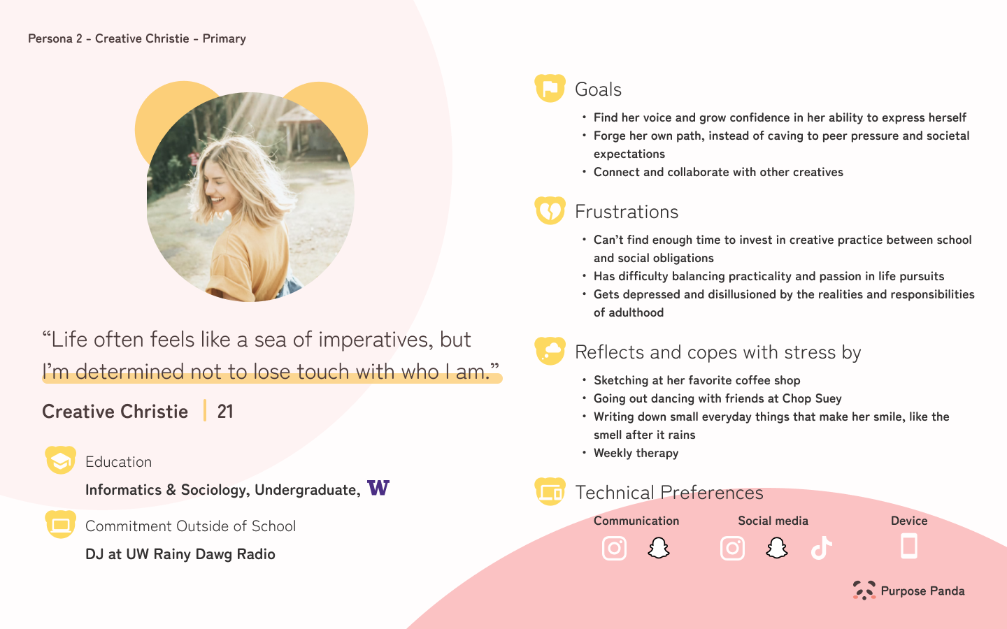
Personas
We generated personas to better understand our target users, collecting the themes of each persona during on team workshop involving individually brainstorming user goals then collaboratively affinity mapping those into broader categories.
Sketching & Ideation
We conducted three rounds of iterative sketching, each followed by discussions of strengths, weaknesses, feasibility, and originality. We then identified common features and labeled each sketch by feature, and voted to determine which features to explore. We landed on attempting to combine social voice notes, creative prompts, and virtual community gardening.

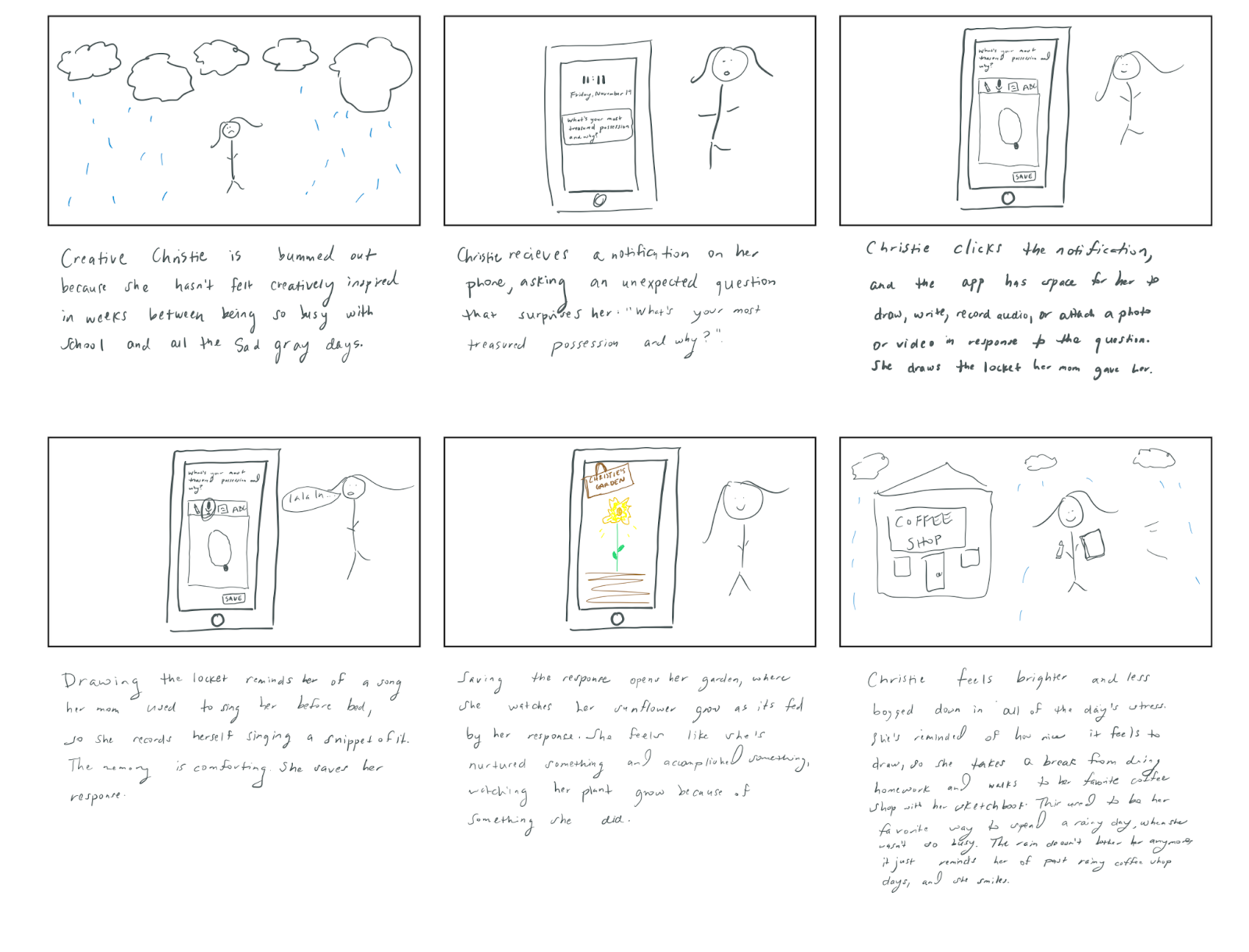
Storyboards
We then developed storyboards exploring scenarios and key interactions for each persona to formulate solution use cases. I wrote the following two…
Gina feels overworked and disconnected from her community, answers a brief creative prompt that sparks a fond memory, checks out her friends’ gardens, reaches out to an inactive friend about that memory, and feels energized to finish her work so she can be social.

Christie feels overwhelmed and uninspired, answers a brief creative prompt that reminds her of much she enjoys drawing, and decides to take a break from work to sketch.
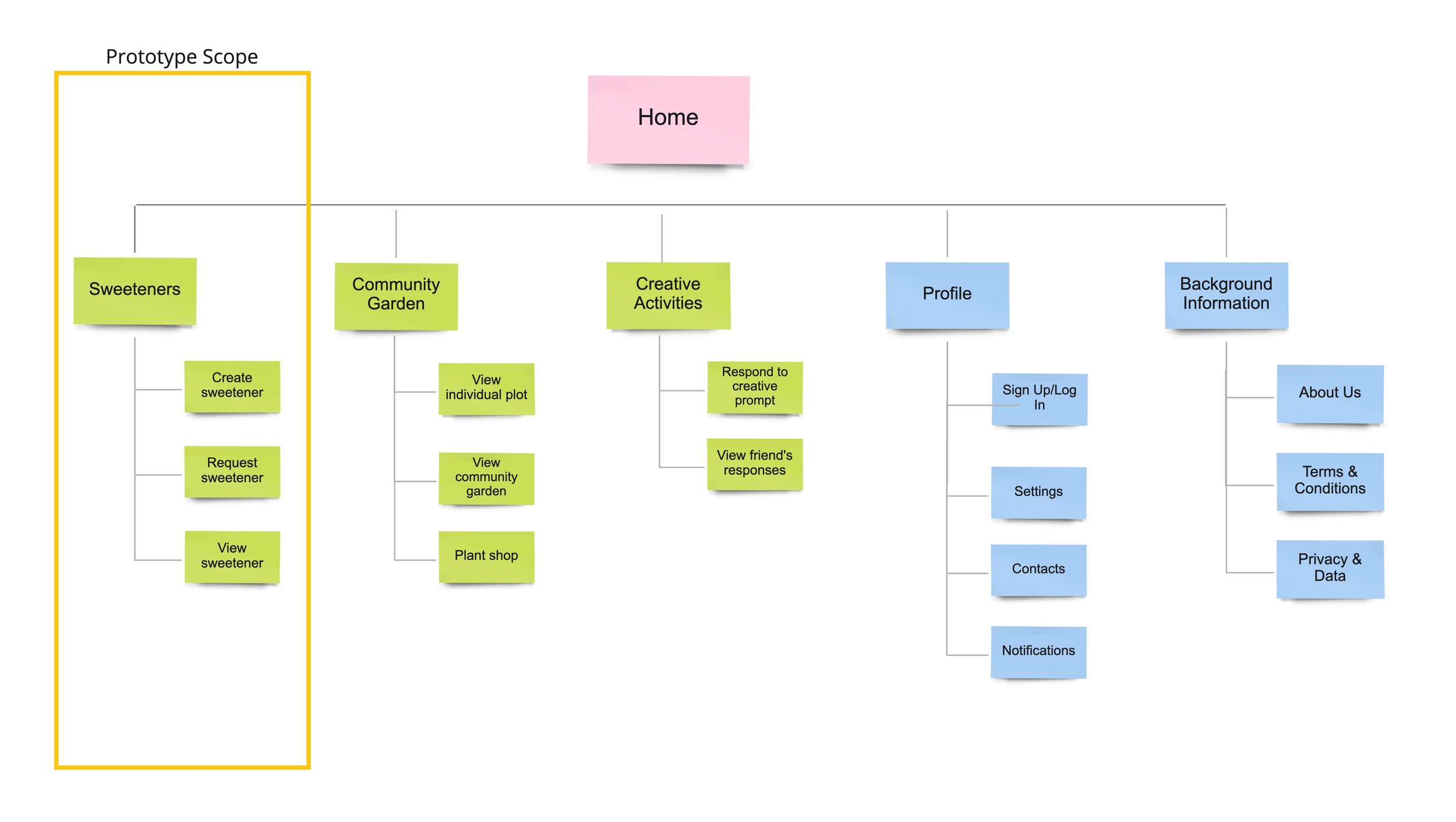
App Map
We envisioned that the app would include each feature, but had to scope our prototype given the tight timeline of the quarter.
Prototyping, User Flows, & Usability Testing
We chose to focus on the sweetener functionality through a vertical prototype that allows users to record, request, and receive sweeteners. Although we were tempted to horizontally explore every facet of the app, which includes sweeteners, creative prompts, and a virtual community garden, we determined that sweeteners were the most approachable and impactful feature to prototype and test given the time constraints. They form the backbone of the thought behind our app concept - that low-touch support and connection with loved ones can help college students feel less overwhelmed. Our user research found that the majority of our primary users reflect and relax by talking to friends and family, and multiple interviewees noted wishing they could invest more time in building deeper relationships and developing community but often struggled to balance that with the responsibilities of work and school.
Sweeteners are like virtual letters. They allow users to express their affection for the people in their life, and to ask others to express it towards them. The initial idea was that they would be voice memos, but we wanted users to be able to customize to what medium they prefer, so they can choose to record audio, video, photo, draw, or write. Users then receive a sweetener each Sunday if one is addressed to them. It’s not real-time communication like other messaging apps - delivery is made into more of a rare special occasion in the hopes that it’ll lift users’ spirits in preparation for the upcoming week. Through usability testing, we seek to understand if this answers our design question, which asks how we can help college students better manage their stress. Although we can’t actually facilitate users communicating with family and friends via the app, which would be ideal, we can observe how they react to and interact with each flow. We want to ensure that users would be interested in and enjoy creating sweeteners for their contacts, would feel comfortable requesting them from contacts, and would be uplifted by the experience of receiving them from contacts.
We created user flows of the three key functionalities: creating, viewing, and requesting Sweeteners. We then designed a mid-fidelity prototype, conducted usability testing to evaluate that prototype, and refined based on feedback to create a final high-fidelity prototype.
Our key usability findings were:
Allow users to skip choosing gift wrap/bow.
Allow users to preview their sweeteners on the preview screen so they don’t need to go back.
Use pastels and candy colors to visually align with the “Sweetener” metaphor.
Functional Prototypes: Mid-Fi | Hi-Fi
Create Sweetener

Open Sweetener

Request Sweetener


