UW & MoPop | Sensory Safe Wayfinding

Museum of Pop Culture | Sensory Safe Wayfinding
UW, hcde 536 interaction design, spring 2022
UX Design / Service Design / Storyboarding / Digital PrototypingDeck | Prototype: pre-visit, real-time
Our team set out to make the Museum of Pop Culture more safe, welcoming, and accessible for visitors with sensory processing challenges. We formed the idea after feeling overwhelmed by our own visit on a busy weekend afternoon, although we have no diagnosed sensory sensitivities. While we genuinely enjoyed the exhibits, the museum as a whole was crowded, loud, stuffy, dark, and there was no opportunity to take a break or get some air.
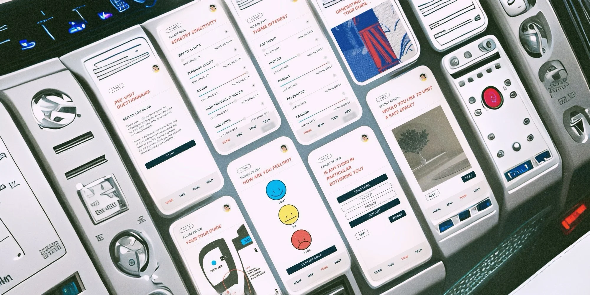
Ultimately, we wanted to create a more inclusive MoPOP experience. Our solution ended up being a multi-pronged approach, involving a pre-visit questionnaire about the visitor’s interests and sensory sensitivities used to generate a personalized tour; real-time tour wayfinding during their visit; real-time wellbeing check-ins and dynamic tour re-routing based on their wellbeing, noted triggers, and the current monitored sensory warning levels of each exhibit; and exhibit-themed sensory safe rooms for visitors to take breaks in and engage with the museum’s content in a more quiet, controlled, and customizable setting. At its core, our solution sought to empower everyone to learn and connect with the museum’s materials in their own way.
Although it was important to think comprehensively about both guiding visitors and providing them with safe spaces, the breadth of our solution did make it difficult to fully design each detail of the experience. We focused on building out the hi-fi mobile app prototype for an individual’s museum visit and simplified the context to a situation in which that individual was the only member of their group with sensory processing challenges. We weren’t able to explore how we’d build tours for groups with members with different challenges or interests, or how we’d accommodate more physical or mental challenges that may hinder visitors’ current experience in the museum (i.e. mobility). This is where our design could go wrong - we might be considering too narrow a window of visitors and ignoring a group that needs more assistance to be able to engage with the museum. As user research wasn’t an aspect of this project, we weren’t aware of the largest concerns facing visitors and were left to extrapolate from our own experience.
We also weren’t able to invest in prototyping the safe spaces at a higher fidelity themselves, although I did build a mockup of a sci-fi exhibit-themed safe space based on initial cursory research into sensory-sensitive design. If I were to do this again, I would’ve encouraged our team to focus more heavily on that aspect of the design, as it has more potential for novelty, creativity, and experimentation. In the initial sketches of what form our solution could take, mine largely focused on places to take a break. I drew outdoor spaces to learn about the Seattle skyline, native bird songs, or plants in pop culture; play in a mini architectural model jungle gym of MoPOP; eat a snack; rest. I also brainstormed quiet indoor spaces like libraries of records and books related to exhibit content; immersive room models of iconic musician’s bedrooms or studios with tactile items like blankets, pillows, and re-printed letters and lyrics with raised handwriting; closets of costume replicas to touch and try on; computer labs with indie games; customizable lighting, temperature, and seating. It would’ve been fun to explore some of those concepts further and see where they led. From a logistical standpoint, a number of questions around how safe spaces would function also remain, like how many visitors can comfortably fit into a safe space; how many spaces would be needed to accommodate the amount of visitors that would use them; and where visitors would be routed if every safe space was full.
Aesthetically, our mobile app was consistent with MoPOP’s existing visual language and emphasized clean design, clear wording, and user customization. Aside from notification-triggered haptics when helping the visitor wayfind or checking in with them about their wellbeing, we designed a purely visual experience. However, with more time, we’d have further explored the role of haptics and sound in guiding visitors through the museum. The safe space is a more immersive physical experience combining the visual, tactile, and auditory. Those spaces would need to be as quiet and neutral as possible, allowing themselves to be malleable to fit any visitor’s needs. Along with tactile items to interact with, headphones would be provided to listen to any content and eye masks would be provided to block out any light. Generally, we’d aim to make them both calming and engaging, depending on what each visitor is looking for.
Ethically, the primary issue I foresee is that our solution isn’t inclusive enough. MoPOP would likely need to unveil a safe space and wayfinding program that accommodated more than sensory processing challenges, so the scope would need to be expanded to include other physical and mental challenges. Regardless, I believe our solution is a solid first attempt at making the museum more approachable, as improving the experience for those with sensory processing challenges moves in the right direction of improving it for everyone. To further build on it, more research would need to be done into what other challenges need to be addressed and how all visitors can be accommodated and made to feel welcome within MoPOP.
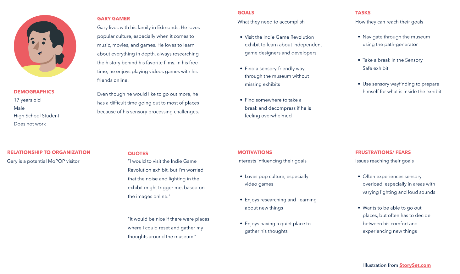
Persona

storyboard


Experience map

service blueprint

SCI-FI SENSORY SAFE ROOM mockup

prototype

