Markel | XRO

XRO
Markel, Spring 2020
UX Design / UX Research / Contextual Inquiry / Service Design / Process Efficiency / Mockups / Full Stack Web Development Outcomes
Designed a new responsive web app that replaced and expanded actions available to users.
Decreased manual XRO-related requests to our team dramatically.
Expanded available reporting on staff usage stats that insurance operations team had requested years prior.
Improved performance and consistency drastically, limiting app downtime to only late night off-hours when refreshing from the data lake.
Allowed our team to sunset 2 outdated tools - the prior .net web app, as well as a QlikView monitoring report that could be replaced via in-app links to the Underwriter Workbook (the renewal data portal app described in another case study).
Brief
Markel’s Data Insights & Reporting Team built XRO in 2010, an automated express renewal process that evaluates upcoming expiring policies against a complex rules engine and sends automatic renewals to those deemed low risk. As the team didn’t have a web developer at the time (I began in 2018), they hired a contractor to build a companion web app for other teams to interface with necessary aspects of the process, i.e. adding new forms, updating agent contact information. However, the app was glitchy, often down, written in .net (which no one knew how to update once the consultant’s contract was over), and incredibly slow as it read and wrote directly from our problematically temperamental enterprise data lake. It also didn’t encompass the full breadth of tasks users needed to complete surrounding the XRO process, so our team received countless manual requests, i.e. needing to exclude certain policies even though they passed the rules engine. In 2020 our team downsized and reached a boiling point where we could not handle the number of incoming requests and bug reports, so we set out to redesign and refactor a better web app that could make everyone’s lives easier.
Design Question
How can we build a more reliable XRO companion app that empowers users, increasing their transparency and agency within the automated process, thereby decreasing our team’s XRO support workload?
Process
Performed a contextual inquiry with users in two distinct user groups - insurance operations & marketing - observing how they used the prior app & other systems to complete their portion of the insurance renewal process. Asked that they walked through the process talking out loud as they shared their screen, moving between different systems to complete each task as they typically would. Identified pain points in the prior app and overall process to target for new additions to the app.
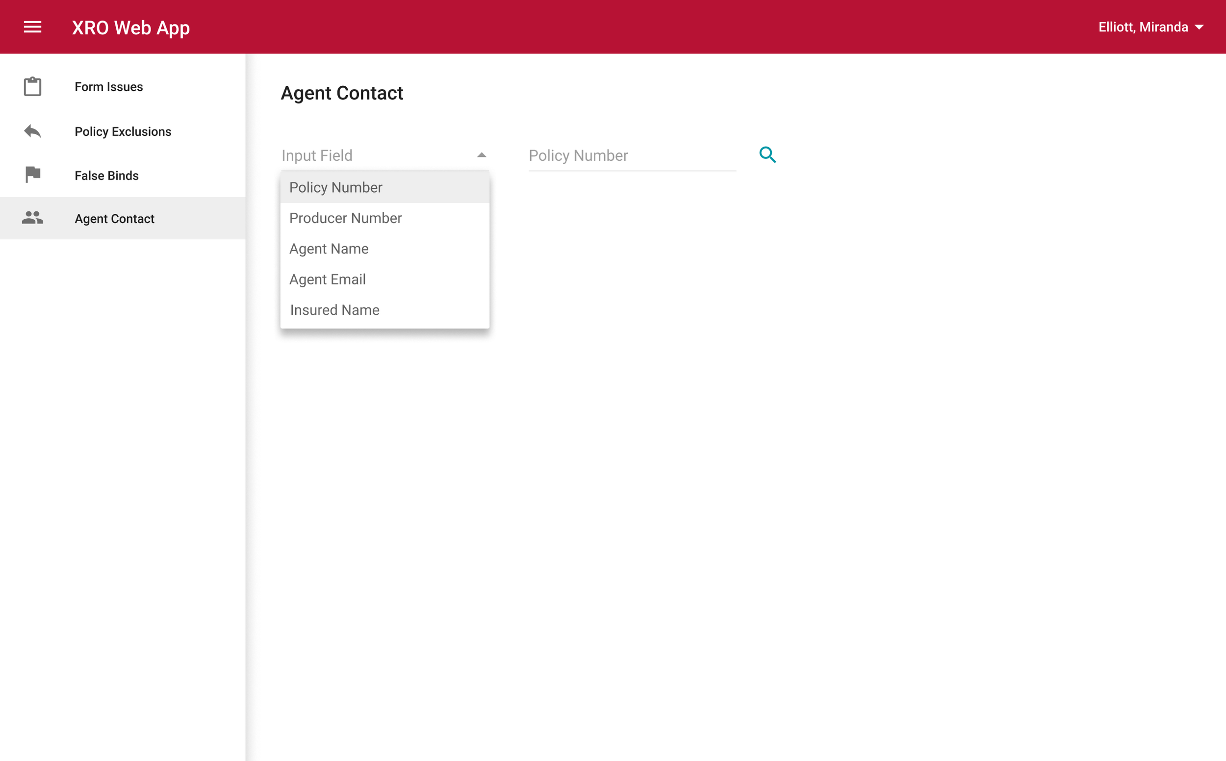
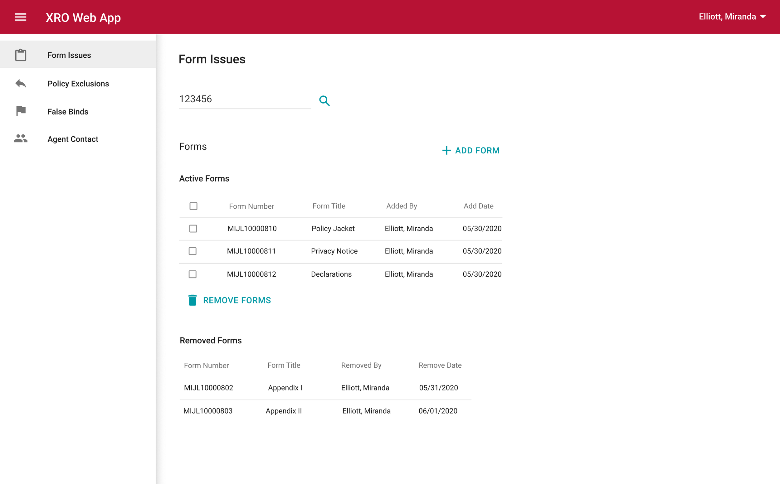
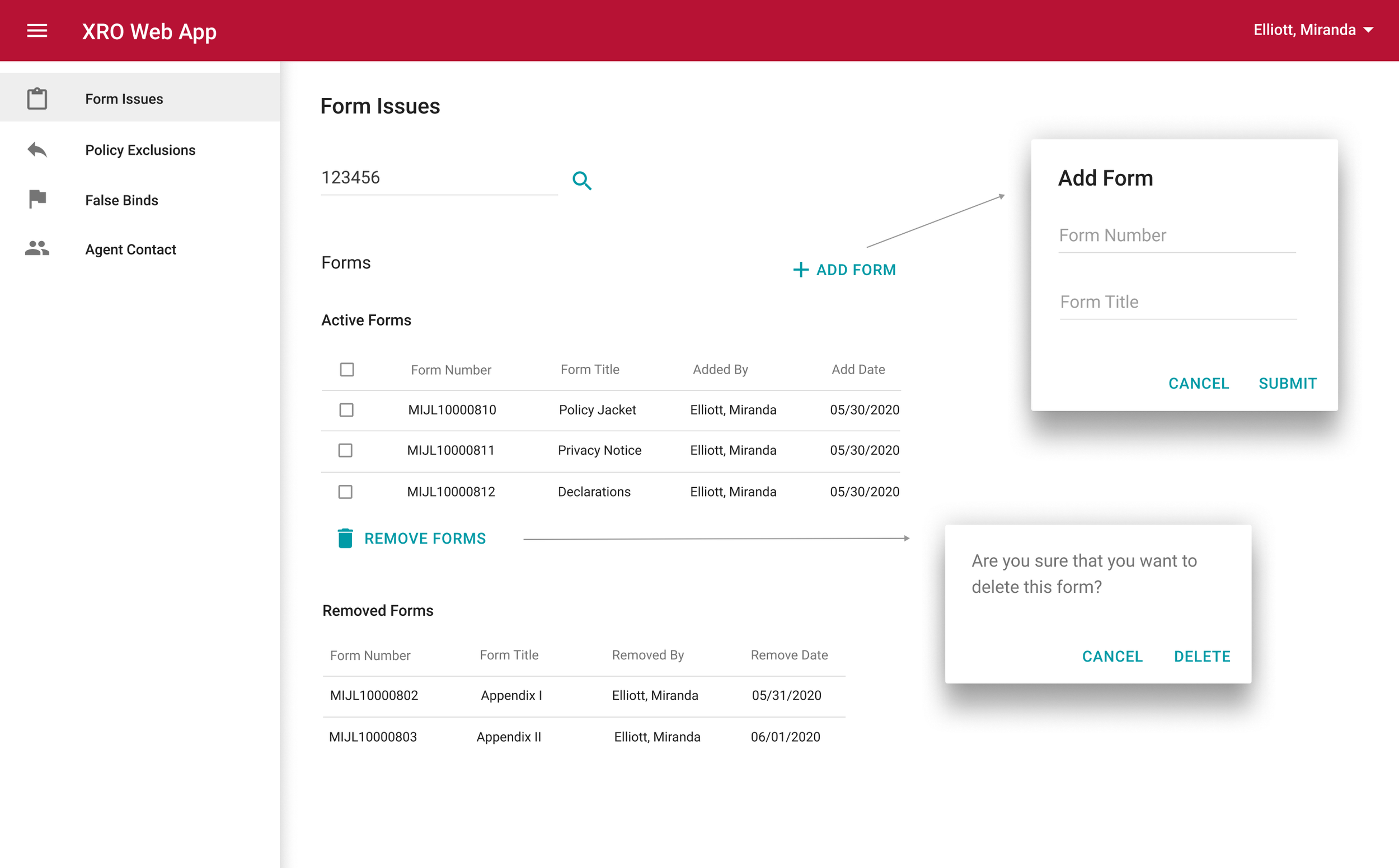
Designed the new app accordingly, taking Markel’s design system, the prior app, and the identified pain points into consideration. Created mockups of each feature of the new app and demoed them for users from each group, soliciting their feedback and iterating for two rounds of updates. Created v2 designs with blue sky service design consolidating data from disparate systems, but prioritized v1 prototypes that focused on replacing the prior app and addressing the most common mailbox requests.
Developed the new app (Python Flask backend, Vue.js frontend, PostgreSQL database), focusing on performance improvement, ease of use, and minimizing downtime by creating a caching process that refreshed from the data lake each night off-hours. Created an admin panel for our team to easily manage users and permissions, as different features are available to different user groups.
Conducted usability testing with members of each user group, validating that they were able to use the new app without receiving any onboarding training.
Mockups
Prior App Screenshots
(This is the app I was replacing, I didn’t design this, don’t worry!)


